A Simple Structure for a Balanced Colour Scheme
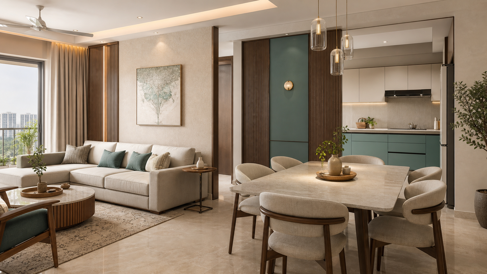
Roughly 60 per cent of the visible surface in a room carries the dominant colour, 30 per cent carries a secondary, and 10 per cent is the accent that finishes it. The percentages are not a rule to be measured with a tape — they are a hierarchy. What matters is that the three roles are distinct, so the eye knows where to rest and where to land.
When a room feels restless, it is almost always because two colours are competing for the same role. When it feels flat, the accent is missing or has been diluted across so many objects that it stopped being an accent.
- 60% — walls, floor, the large upholstery, the bulk of the joinery.
- 30% — feature wall, curtains, rug, a secondary joinery finish, the bed or sofa.
- 10% — cushions, metal trims, light fittings, handles, art, one deliberate object.
Choose a Dominant Colour That Can Carry the Room
Our default for the dominant sixty is a warm neutral — sand, oat, greige, warm off-white. Not because it is safe, but because of what it does to light. Bengaluru gets a lot of bright, slightly cool daylight; a warm base absorbs that and gives it back as something comfortable rather than clinical.
Pure brilliant white is the most commonly chosen and most commonly regretted wall colour we encounter. It goes blue in north light, it shows every scuff, and it leaves the accent nothing warm to sit against.
Add a Supporting Colour for Depth and Definition
Warm neutrals alone drift. The secondary thirty is what stops the room floating — a deep charcoal, a forest green, a walnut veneer, a slate blue. It typically arrives as a feature wall, the curtains, the rug, or the darker of the two joinery finishes.
The pairing we return to most often is warm neutral with deep charcoal, because charcoal is a true neutral dark: it does not fight the wood tones, it makes brass and gold read as gold rather than yellow, and it photographs honestly.
One practical caution for apartments: keep the darkest surface off the wall that faces your main light source. A dark wall opposite the window absorbs the daylight you have; a dark wall beside the window reads as depth instead.
Use Accent Colours with Restraint
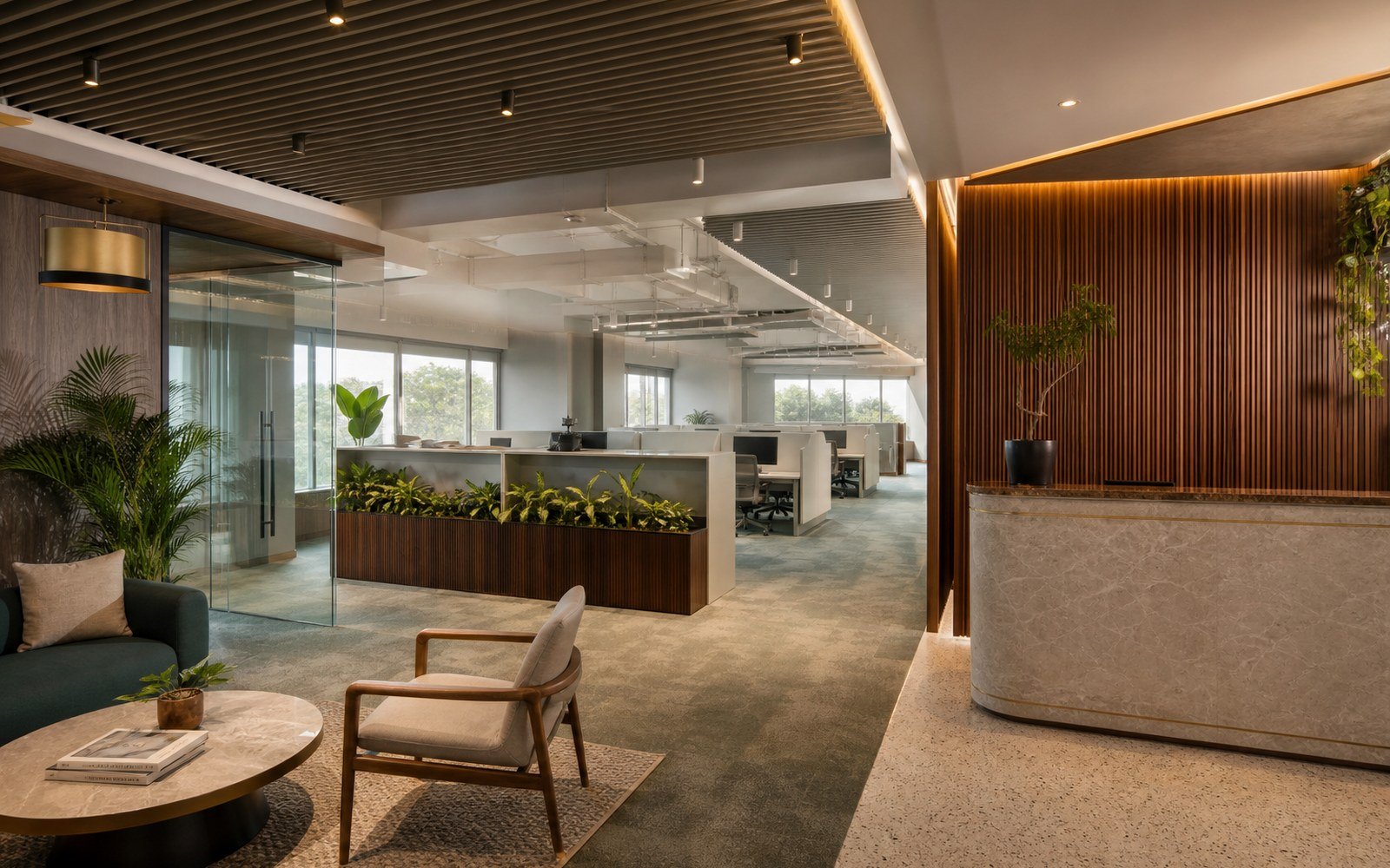
The accent is the smallest share and the one that gets abused. Gold in particular is easy to over-apply, at which point it stops reading as luxury and starts reading as a showroom.
Three habits keep it disciplined:
- Pick one metal and commit. Brass, brushed gold or champagne — whichever you choose, it should repeat in the handles, the light fittings and the trims. Two competing metals in one room reads as an accident, not a mix.
- Prefer brushed over mirror-polish on anything you touch. Polished gold on handles will show every fingerprint and every early scratch.
- Repeat the accent at least three times, and no more than about five. Once is a stray object; three times is a rhythm; ten times is a theme park.
Why Undertones Decide Whether Colours Work Together
Two beiges from two brands will not sit together if one leans pink and the other leans green. Nine out of ten palettes that fail on site fail here, not on the choice of colour family.
The check is simple: put your samples side by side on white paper, in daylight, and ask which way each one leans. Warm undertones go towards yellow, red or orange; cool ones towards blue, green or violet. Keep the whole palette on one side of that line, then let the accent be the one deliberate contrast.
Wood and stone count. A walnut veneer is a warm brown and a wenge is a cool one; a Carrara-style quartz is cool, and a travertine is warm. These are large surfaces, so they set the undertone of the room whether or not you chose them for that reason.
Adapting the Palette from Room to Room
| Room | 60 — dominant | 30 — secondary | 10 — accent |
|---|---|---|---|
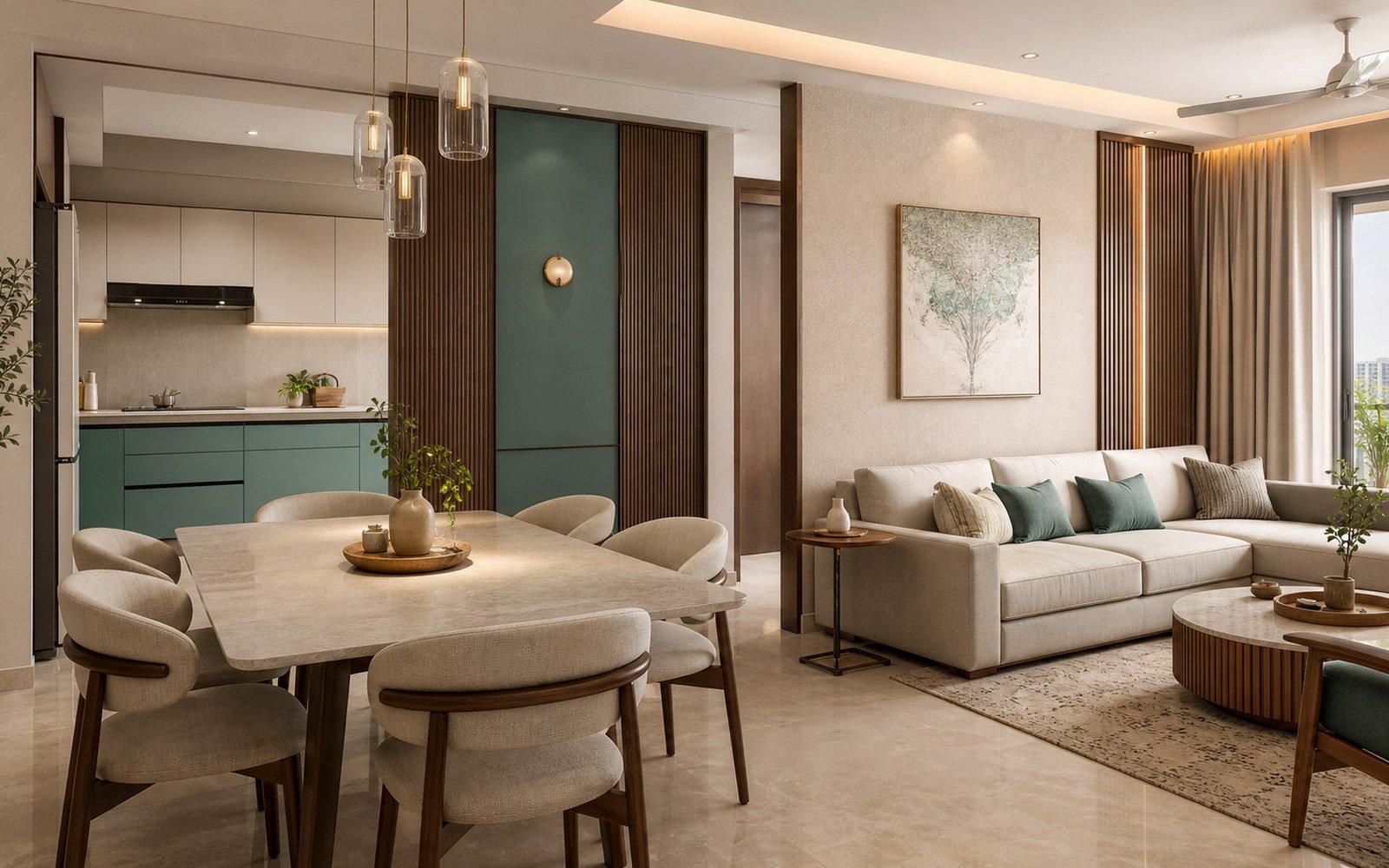
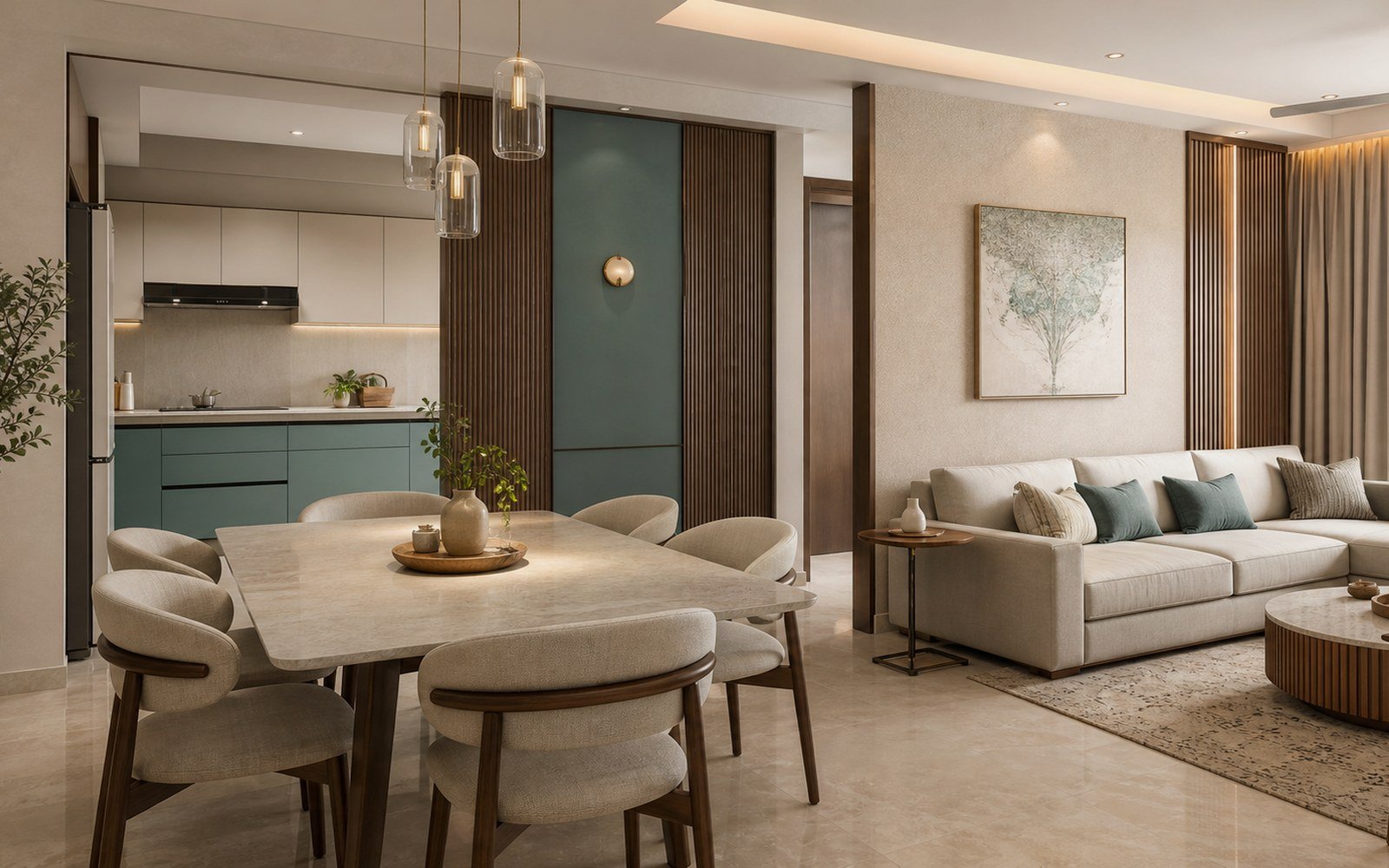
| Living room | Warm off-white walls, oat upholstery | Charcoal feature wall or curtains, walnut console | Brass trims, one ochre cushion set, picture light |
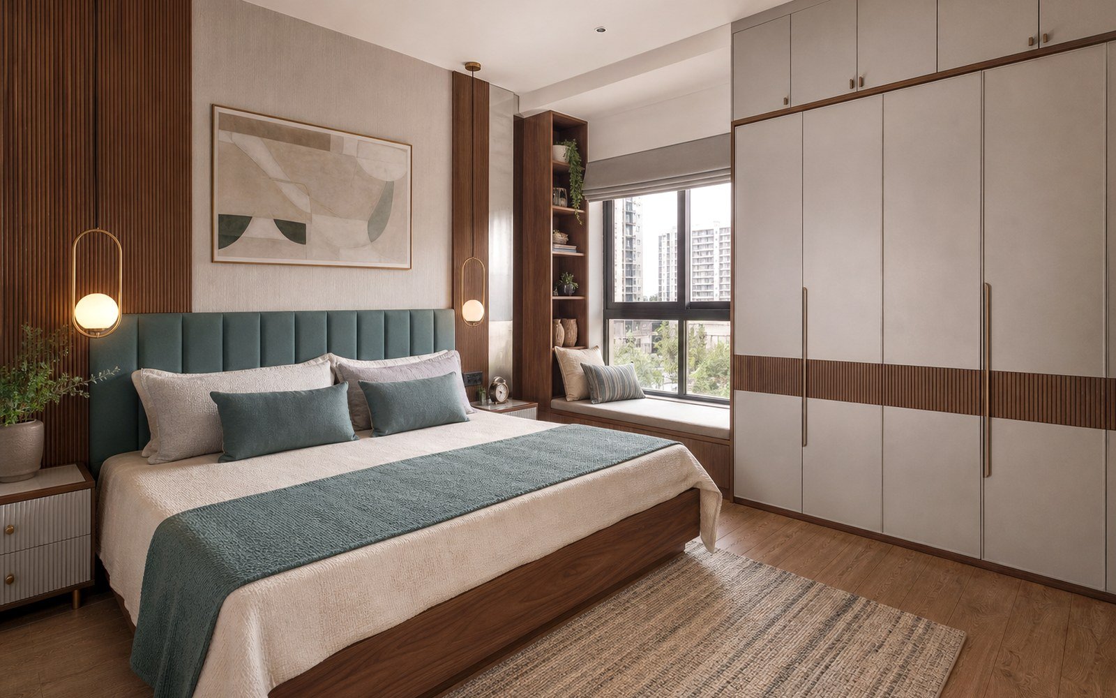
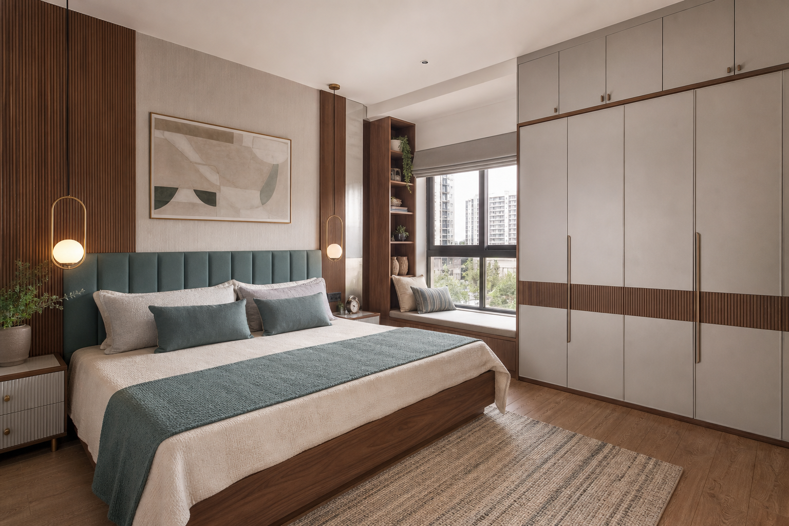
| Primary bedroom | Greige walls, cream bedding | Deep green headboard wall, oak wardrobe fronts | Brushed gold handles, bedside lamps, art frame |
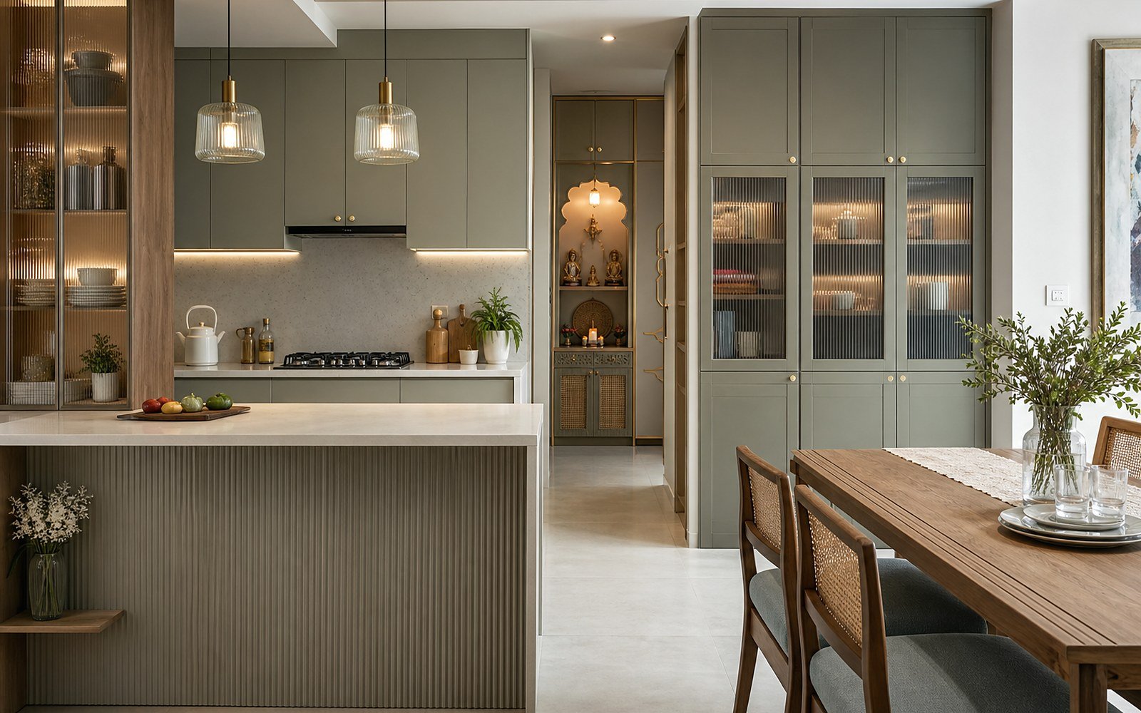
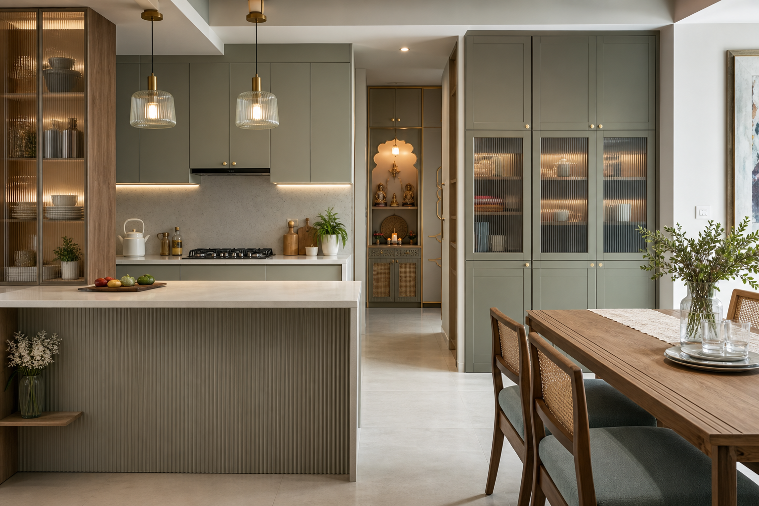
| Kitchen | Light shutters and quartz top | Darker base units or a stone backsplash | Metal profile handles, pendant over the island |
| Children’s room | Soft neutral walls | One saturated colour on the study wall or bed | Two accessory colours that can be changed cheaply as they grow |
Test Colours in the Actual Light Before Finalising
No palette gets signed off in our studio on a screen alone. We put the physical samples — paint card, veneer, laminate, stone chip, fabric — on the actual floor of the actual room, and look at them three times: mid-morning daylight, late afternoon, and under the artificial light that will be installed there.
Colours shift more than people expect between those three moments, and the palette you choose under a showroom’s 6500K lighting will not be the palette you live with at 3000K. Ten minutes of this saves a repaint.
Timeless is not a colour. It is proportion, one undertone family, and the discipline to stop adding.
If you would like help building a palette around a piece you already own — a floor you cannot change, a sofa you love — that is exactly the sort of constraint our design team enjoys. Bring it to us.